Panic! at the Disco - Vices and Virtues
The room is fairly dark but the lighting is centred around the band members enforcing their importance to the audience as it directs their focus to the two figures. The colours are fairly dull and dark, making the rich red stand out, this is a colour typically associated with the rock/indie genre as it is symbolic of passion and rebelliousness. Black is also used throughout the image, which is again associated with said genre and is symbolic of being edgy and sophisticated, complying to the overall atmosphere of the album cover. It may also indicate to the audience that many of their songs will feature the theme of love. They are sitting on an ornate sofa, and all the elaborate decoration makes the cover quirky and interesting for the audience, this lack of simplicity also allows the audience to interpret the cover in many ways, thus they may be able to relate to whatever message they derive from it. The two band members are wearing suits, portraying them as professional and important. They are both sitting with their legs crossed, giving relaxed body language, suggesting they are comfortable and somewhat rebellious despite the old fashioned, prestige setting. This will appeal to the audience as it is a typical value of rock and indie music. They are also mirroring each other’s poses, this can create a sense of unity between them, enforcing their relationship as a band and attracting the audience as it is unique and helps it to stand out from other more ‘safe’ covers. There is a figure standing behind them wearing a strange mask, creating an unsettled feel, and indicating to the audience that their music will be quirky and even slightly dark. It also again leaves the meaning of the cover open to interpretation, some may see this figure as a threat to the band and feel emotion for them, drawing them into the cover and causing them to feel a relationship between them and the band members. The text ‘Vices and Virtues’ is discreet and in an elaborate elegant text, complimenting the overall ‘high class’ fancy atmosphere of the cover. The band’s name is written in their typical ‘logo’, this gives a feeling of familiarity as it reoccurs throughout their covers and music videos. The record player is also a reoccurring image throughout their work, again portraying them as quirky as well as allowing the audience to recognise this image and be able to identify with it.

White Lies - Ritual
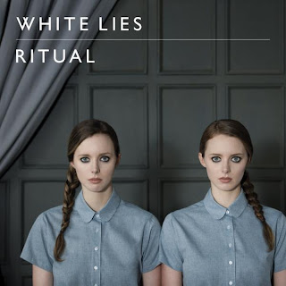
The colour scheme is very simplistic and consists of different shades of blue and grey. These subtle differences create a somewhat mature, sophisticated atmosphere; these are also connotations of the colours. Blue is symbolic of being masculine, however the soft shade of it has made the cover appear more feminine than a bright blue, thus will appeal to both genders. The image shows two twin girls simply looking out of the cover. The audience may find this image makes them feel uncomfortable as their stare is intense, almost as if they are looking straight at the audience. This sense of unease relates to the fact the band are often somewhat strange and controversial in their lyrics and videos, all this helps them to stand out from other indie bands especially the quirky image. It also appeals to the target audience of individualists or mainstreamers believing themselves to be individualists, as it appears quirky and original. It is also hard to define whether the girls are simply a mirror image of each other that has been flipped, or if they are twins, as they are identical but the image is strange and somewhat abstract. She is wearing a blue shirt done up to the top, making her appear smart and like someone who would listen to the indie/rock genre, reinforced by her dark dramatic eye makeup. However, she also appears fairly young and innocent, for example by her long hair being tied into a plait. This may appeal more to females as it shows signs of femininity and even displays her to be vulnerable. The band members are not shown on the cover, this creates a sense of mystery concerning their identities and can cause the audience to become curious thus more likely to buy the album, particularly as the indie/rock genre tends to value the artist behind the music. The text is white, connotating innocence; this can be seen to relate to the plaits worn by the girls. The audience may also interpret it to be symbolic of the enlightenment that they may experience by listening to this band, implying they are special and unlike other bands, persuading the audience to buy the album. In addition it allows the text to stand out from the more bland background which indicates it to be the most important aspect of the cover. It is written in capital letters, this combined with the fact the letters are spaced out could imply independence and confidence to the audience, which again will particularly appeal to individualists.

Bombay Bicycle Club - I Had The Blues But I Shook Them Loose
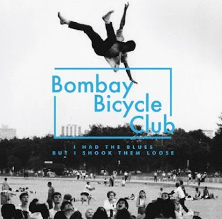
The cover consists of a black and white photo taking up the entire space; it has an old fashioned, home camera feel to it due to the black and white grainy effect. The image shows a man in the air above what appears to be a park or playground full of figures, many of which are crowded to watch him. The audience do not know whether he has been thrown in the air by the people or if he is simply falling, it is down to their perspective thus makes them curious. This is also enforced not only by the ambiguity of the image but its quirky, unusual nature. The text is in a bright blue, standing out from its black and white background thus is able to catch the audience’s attention by being the dominant aspect of the page. The band’s name has a rectangle surrounding it, this makes it appear to be like a stamp, which could imply to the audience the band is particularly famous and important, it gives the impression they are well known. It also draws the readers’ eyes to the band name, again emphasising its importance on the cover. The letters are in capitals and spread apart, thus they can represent independence and individuality, standing out for others. This will therefore appeal particularly to individualists or mainstreamers believing themselves to be individualists, as they will value standing out from the rest of society and staying from popular culture. These are usually the typical audience of indie/rock bands, thus the cover will be effective in attracting the attention of the bands target audience.