Showing posts with label Research. Show all posts

Monday, 8 August 2011

10 Iconic Music Video Stills

In order to gain better understanding of the music video industry and what makes a successful music video I researched some of the most iconic music videos of all time. I combined both those I felt personally to be iconic and origanal, and those that are universally percieved to be iconic. I chose ten music videos and took still which I believe to be particularly famous or effective from them.


Radiohead - No Surprises


Talking Heads - Once in a Lifetime


Madonna - Vouge


Lady GaGa feat. Beyonce - Telephone


Madonna - Like A Prayer


Queen - Bohemian Rhapsody


Ok Go - Here It Goes Again


Oasis - Wonderwall


Britney Spears - Baby One More Time


Micheal Jackson - Thriller


Friday, 15 July 2011

The Vaccines 'If You Wanna' - Reverse Storyboard

I created a reverse storyboard of the music video 'If You Wanna' by The Vaccines.


Saturday, 9 July 2011

The Naked and Famous – Young Blood Analysis


The video opens with a background of soft pastel colours blending into each other, almost like clouds. Pastel colours are often symbolic of babies, thus it is immediately emphasising the importance of youth to the audience. Both pale pink and blue are featured, thus indicating that it is targeted at both genders, that youth is united as a whole. The song title ‘Young Blood’ then appears on screen in handwritten style text, appearing somewhat childlike, thus again further pushing the message of youth to the audience. The text is white, connotating innocence and purity, therefore implying that these are aspects of youth. It follows no particular narrative, instead it is a montage of non related shots of young people, each shot showing a different person doing a different action. These actions are exciting and empowering to the audience, from floating in the middle of vast spaces of water, jumping on cars and running through huge open green fields. These images can be seen as very inspirational to the audience, as the figures are portrayed as free and happy, enforcing the idea youth and how it should be reckless and fearless. This is for example enforce by the image of a cut hand with blood trickling down the fingers, however this is not presented in a negative light, it seems to send the message that youth is meant to be somewhat dangerous. A wide variety of camera angles are used throughout the video, creating both and artistic atmosphere to the video and again enforcing this feeling of inspiration. There are some odd yet even iconic images, such as a girl walking slowly into a lake eventually immersing herself in the water. This can be symbolic of accepting youth and all that comes with it, and the moral message that this is a positive thing for young people to do, despite the negativities. Each shot shows only one person in the frame, this can be symbolic of individuality in youth, which is a value of teenagers as a group thus appeals to the target audience. It will also appeal to individualists as will the quirky original images, this means again it will appeal to its target audience as those that listen to indie/alternative music are typically individualists or mainstreamers believing themselves to be individualists.
The band members are featured in the video, however they are presented in the same way as all the non band members, they are not idolised in any way. This means the audience will interpret them to be equal and more able to identify with then, essentially creating a feeling of unity in young people, which corresponds with the message from song lyrics. Instead it seems to idolise the idea of being ‘young and foolish’ and implies that we must make mistakes whilst we are young. It is empowering to the teenage audience and gives a positive representation of them as a group, which may particularly appeal to them as it accepts their faults but still views these as good things. It drastically contrasts with many of the portrayals and stereotypes of teenagers given in the media, thus this fresh new take on adolescence will attract a wider audience and variety of people Teenagers will feel like they are part of something and a sense of belonging when watching this video, relating to the concepts of personal identity and personal relationships from the uses and gratifications theory.

Thursday, 7 July 2011

Panic at the Disco - The Ballad of Mona Lisa Analysis


This comeback video’s introduction almost mirrors the bands first music video ‘I Write Sins Not Tragedies’, lead singer Brendon Urie is even wearing the same top hat that he wore in their debut video. This can be considered an iconic image that is associated with the band, it allows fans to recognise this object and thus re indentify with the band members despite some members leaving and them going on a break. This therefore will aid their comeback and reconnect with old fans, as ‘I Write Sins...’ was very popular and had a similar atmosphere and feel to their new video, for example it is again in the setting of a church, though this time is for a funeral as opposed to a wedding. The church with it strange ornate decoration is an unusual setting for a music video, directly contrasting with the typical settings of other genres. This makes them appear unique and daring, which are attributes valued by the indie/rock genre as they are typically individualists or mainstreamers believing themselves to be individualists. The video follows a somewhat linear narrative structure, with the audience having a restricted narrative viewpoint, as they do not know whose body is under the white sheet and thus who the funeral is for, the video essentially revolves around someone named Mary at a person’s funeral. Furthermore they are unknowing as to who the killer was, this creates tension and curiosity in the audience, making them more involved in the narrative for the video as they try to work out these mysteries. There are also 6 rules that it appears one must abide when someone dies, that come up as old fashioned yellow text onscreen, this adds a more unique interesting element to the video. It also implies to the audience that someone actually murdered the individual that is dead; this is implied subtly throughout to be Mary, as she is featured in the screen in many of these shots. This is also suggested by the fact the Brendon keeps switching between his performance self, and a weaker, pale version of himself, we eventually come to realise that he is dead and trying to figure out his own murder, adding to the concept of a ‘murder mystery’ in the video. The video however keeps emphasis on the importance of performance, as throughout it appears fairly over the top and Brendon sings throughout. The camera also uses various shots of musician Spencer playing drums and Brendon sings throughout, this enforces the atmosphere and feeling of performance to the audience rather than it simply being a narrative video. When the white sheet is dragged back to reveal his body and the young girl discovers and old tattered note saying ‘Mary did it’ the music enforces this to be the climax of the video and creates shock and emotion in the audience as they video finally fits together.

Paramore - Misery Buisness Analysis


The video for Paramore’s ‘Misery Business’ uses many generic signifiers of the indie/rock genre, thus conforms to the first part Goodwin’s theory, that videos will show genre characteristics. The lead singer Haley has brightly coloured, messy hair, this combined with her dark eye makeup makes her appear edgy and rebellious, they are also very much symbolic of the rock genre. The video also uses a somewhat linear narrative structure, beginning with cuts between the band performing and the familiar scene of an American high school, complete with recognisable stereotypes of ‘clique, with the antagonist being the popular, powerful ‘bitch’ who will eventually be overcome by the band. This change in power is seen in many other rock videos, such as Marilyn Manson’s ‘Tainted Love’. Therefore, by overcoming the antagonist the band is reinforcing the rock genre values to the audience, implying it is the dominant genre. There are many other typical aspects of rock music videos, such the initial stage performance that the video cuts to throughout the video. Rock music as a genre typically values live performances highly, thus this will help it appeal to its target audience. In addition there are many fast cuts within the video which is often seen in the rock genre as the music is usually fast paced and energetic. There is much use of the colours red and black, for example in the band clothes, which are colours typically associated with rock music. Red can be symbolic of rebelliousness and passion, typical values of the rock genre. Black connotates being sophisticated and original, again traits that are often valued highly by people who listen to said genre of music, as they are typically individualists or mainstreamers believing themselves to be individualists. There is also much key iconography of the rock genre, such as the guitars and drums, close ups of these are used to reinforce the genre to the audience, as they will immediately identify with this familiar image and recognise it to be a rock video.There are also many close ups of the band, particularly the singer Haley, especially her eyes and mouth, relating to the act of ‘looking’ in society and how he artist should be the main focus of the audience despite the other narrative structure The room in which the band is performing has the album name and logo in graffiti over the walls, this is used as a motif throughout the album and videos and enforces the values found in rock music, such as rebelliousness and a ‘not bothered about anything’ attitude. It also refers to the purpose of music videos being an advertisement, all the these are demands of the record label. There is very little voyeuristic treatment of the main singer, which is typical of the rock genre as they tend to present female artists more equally to men and not as objects but independent people in themselves. However, the antagonist is dressed in a somewhat provocative way, though this can be argued to be being critical of such women as she is eventually overcome by Haley who is not dressed or portrayed in such a way.

Sunday, 3 July 2011

Magazine Adverts Analysis

The Drums

The colours of the image are dark and fairly dull; this allows the white text to be more prominent on the page. The image is of an old wooden stage, with a curtain towards the back of the picture. This gives the idea of the band performing live to the audience, which is suitable for the genre as indie/rock music tends to value live performances more than other genres. The band members are not featured in the cover, this creates a sense of mystery and may lead the audience to be curious, thus more likely to go out and buy the album. It also implies them to be exclusive and higher their status as a band, as they are not all about image but instead serious about their music. Instead, the band name ‘The Drums’ is spelled out in wooden letters. The light is entering the image from the far left and is focused around the band name, thus emphasising their importance to the audience. This causes the letters to cast a shadow over the stage, as well as creating an interesting effect it again implies the band to be big and of high status. The letters are almost replacing the band members on stage, as the light appears to be like a spotlight, as we would see on stage at a gig. This quirky unique image will appeal to those who enjoy the indie/rock genre as they are typically individualists or mainstreamers believing themselves to be individualists, thus would reject mainstream images that may be seen in the pop genre. The date of the album release is in bold white text, allowing it to stand out from the dark background image, this is vital as it raises awareness of the release. It also enforces its importance, and even suggests to the audience it is a special, important event thus they should remember the date, even count down the days until its release. The words ‘the album’ implying it to be exclusive and of particular importance in the music industry, thus persuading the audience to buy the record. The advert also keeps up to date with current technology as it includes the website address and a site where the album is available to download online. This will particularly appeal to young people as the internet is very much the ‘zeitgeist’ of our decade and thus the band appears current. It will also appeal to young people as downloading music is much simpler than going out and buying a CD. The record company’s logo is also featured in small white text in the corner, promoting the company and implying to the audience they should perhaps download more music from that company as if they enjoy this record, they will enjoy those too.


The Chemical Brothers


The advert features an abstract image which dominantes the majority of the page, of a woman diving into water. Her face is in shadow thus the audience do not know her identity, creating a sense of mystery and grabbing the audiences attention as they are curious. This will appeal to the audience as it is unique thus will stand out from other, more mainstream images , especially when considering its alternative genre. The background is plain black, which is often assosciated with the alternative genre, again indicating to the target audience that this is an album they may enjoy. It also is symbollic of being sophisticated which is enforced by the overall mature atmosphere os the advert, and is suitable as the audience will typically be slightly older than say of the pop genre.The band name is written in their usual text, almost like a logo. This in turn creates a feeling of familiarity as it occurs frequently throughout their products, thus audiences will be able to recognise it. The text describes the album as ‘astonishing’, again helping persuade the audience to buy it by implying it to be of a high standard.The date isalone on the last line,this may leave it in the memory ofthe audience and enforces the importance of the albums release, almost portraying it as a vital event.


Tom Petty and the Heartbreakers


The advert uses a simplistic colour scheme of red black and white, colours often seen related to the rock genre. Red has connotations passion and being rebellious and exciting, these are values that are held by the rock genre. Therefore, by using these colours the target audience is immediately attracted to the advert, this is also due to it conforming to the basic codes and conventions that are seen in the rock genre. A black and white image is used showing the members of the band, this helps create their identity as artists which will in term appeal to the audience, particularly serious fans of the band. The title ‘mojo’ is written in large capital letters, implying to the audience that it is of high status in the music industry thus helping persuade them to buy it. The letters are bold and spaced out, giving it a more masculine appearance thus appealing more to males. It is in white text, allowing it to stand out from the background and thus is one of the most prominent aspects of the page. The red shadow or shading lends particular weight to the text making it heavier and thus more important and eye catching for the audience. The text ‘their first studio album in 8 years’ enforces the importance of the record to the audience and helps create excitement in them. The advert appears current and up to date as it gives a website and states that you can download the album, this will appeal particularly to younger people as the internet is very much the ‘zeitgeist’ of our decade and for its ease of use. The date is bold and clear, again emphasising the importance of the album’s release.

Thursday, 30 June 2011

Album Cover Analysis


Panic! at the Disco - Vices and Virtues


The room is fairly dark but the lighting is centred around the band members enforcing their importance to the audience as it directs their focus to the two figures. The colours are fairly dull and dark, making the rich red stand out, this is a colour typically associated with the rock/indie genre as it is symbolic of passion and rebelliousness. Black is also used throughout the image, which is again associated with said genre and is symbolic of being edgy and sophisticated, complying to the overall atmosphere of the album cover. It may also indicate to the audience that many of their songs will feature the theme of love. They are sitting on an ornate sofa, and all the elaborate decoration makes the cover quirky and interesting for the audience, this lack of simplicity also allows the audience to interpret the cover in many ways, thus they may be able to relate to whatever message they derive from it. The two band members are wearing suits, portraying them as professional and important. They are both sitting with their legs crossed, giving relaxed body language, suggesting they are comfortable and somewhat rebellious despite the old fashioned, prestige setting. This will appeal to the audience as it is a typical value of rock and indie music. They are also mirroring each other’s poses, this can create a sense of unity between them, enforcing their relationship as a band and attracting the audience as it is unique and helps it to stand out from other more ‘safe’ covers. There is a figure standing behind them wearing a strange mask, creating an unsettled feel, and indicating to the audience that their music will be quirky and even slightly dark. It also again leaves the meaning of the cover open to interpretation, some may see this figure as a threat to the band and feel emotion for them, drawing them into the cover and causing them to feel a relationship between them and the band members. The text ‘Vices and Virtues’ is discreet and in an elaborate elegant text, complimenting the overall ‘high class’ fancy atmosphere of the cover. The band’s name is written in their typical ‘logo’, this gives a feeling of familiarity as it reoccurs throughout their covers and music videos. The record player is also a reoccurring image throughout their work, again portraying them as quirky as well as allowing the audience to recognise this image and be able to identify with it.
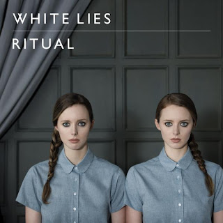


White Lies - Ritual
The colour scheme is very simplistic and consists of different shades of blue and grey. These subtle differences create a somewhat mature, sophisticated atmosphere; these are also connotations of the colours. Blue is symbolic of being masculine, however the soft shade of it has made the cover appear more feminine than a bright blue, thus will appeal to both genders. The image shows two twin girls simply looking out of the cover. The audience may find this image makes them feel uncomfortable as their stare is intense, almost as if they are looking straight at the audience. This sense of unease relates to the fact the band are often somewhat strange and controversial in their lyrics and videos, all this helps them to stand out from other indie bands especially the quirky image. It also appeals to the target audience of individualists or mainstreamers believing themselves to be individualists, as it appears quirky and original. It is also hard to define whether the girls are simply a mirror image of each other that has been flipped, or if they are twins, as they are identical but the image is strange and somewhat abstract. She is wearing a blue shirt done up to the top, making her appear smart and like someone who would listen to the indie/rock genre, reinforced by her dark dramatic eye makeup. However, she also appears fairly young and innocent, for example by her long hair being tied into a plait. This may appeal more to females as it shows signs of femininity and even displays her to be vulnerable. The band members are not shown on the cover, this creates a sense of mystery concerning their identities and can cause the audience to become curious thus more likely to buy the album, particularly as the indie/rock genre tends to value the artist behind the music. The text is white, connotating innocence; this can be seen to relate to the plaits worn by the girls. The audience may also interpret it to be symbolic of the enlightenment that they may experience by listening to this band, implying they are special and unlike other bands, persuading the audience to buy the album. In addition it allows the text to stand out from the more bland background which indicates it to be the most important aspect of the cover. It is written in capital letters, this combined with the fact the letters are spaced out could imply independence and confidence to the audience, which again will particularly appeal to individualists.
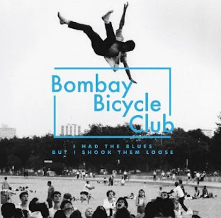


Bombay Bicycle Club - I Had The Blues But I Shook Them Loose

The cover consists of a black and white photo taking up the entire space; it has an old fashioned, home camera feel to it due to the black and white grainy effect. The image shows a man in the air above what appears to be a park or playground full of figures, many of which are crowded to watch him. The audience do not know whether he has been thrown in the air by the people or if he is simply falling, it is down to their perspective thus makes them curious. This is also enforced not only by the ambiguity of the image but its quirky, unusual nature. The text is in a bright blue, standing out from its black and white background thus is able to catch the audience’s attention by being the dominant aspect of the page. The band’s name has a rectangle surrounding it, this makes it appear to be like a stamp, which could imply to the audience the band is particularly famous and important, it gives the impression they are well known. It also draws the readers’ eyes to the band name, again emphasising its importance on the cover. The letters are in capitals and spread apart, thus they can represent independence and individuality, standing out for others. This will therefore appeal particularly to individualists or mainstreamers believing themselves to be individualists, as they will value standing out from the rest of society and staying from popular culture. These are usually the typical audience of indie/rock bands, thus the cover will be effective in attracting the attention of the bands target audience.

Research into Music Videos

Monday, 20 June 2011

Research Audit

These were my initial ideas as to what resources I had access to when I create my music video, from who could feature in it to the possible locations in which I could shoot it. I decided that living close to London leaves me with access to a variety of different interesting locations and therefore I decided to take advantage of this. By doing this it allows me to see clearly what facilities and resources I have access to and thus what genres of music videos and ideas would be suitable for me to create. It essentially tells me what I am able to produce and what would not be possible. After looking through my possible resources I have decided to create an indie/rock video as it is the most suitable for me in which I can exploit and take advantage of my available resources such as musical instruments and locations in London.